


What’s in a name?
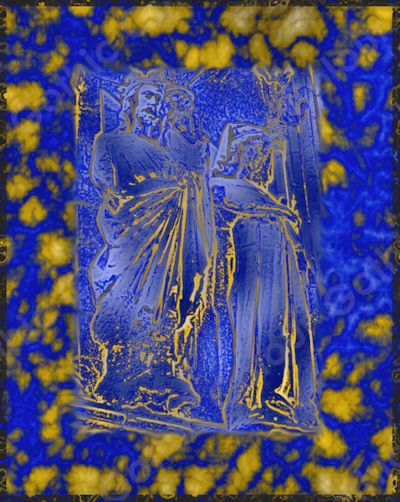
I assume one could suggest some long-winded explanation about style and colour as to why my design brand is called Gothic Colour but the truth is less fancy. I adopted this name because of a design I made based on a photograph I took at Lincoln cathedral. It was something I did years ago when I was first experimenting with design software and I have a bit of a soft spot for it. The name then stuck.
Gothic engravings and contrasting colours aside, the logo I created for Gothic Colour uses a variety of fonts of differing styles in order to indicate the diversity of designs that I like to create. Indeed, my usual style tends to be that of, what I’d call, flamboyant gloom but that doesn’t mean that I don’t also enjoy creating more effervescent designs: from cute pastels, jewel hues, to black and white monochromes, from nature inspired drawings, abstract geometry, to damask inspired designs. Add some digitally modified photography and there you have it; Gothic Colour in a nutshell.
...and about me:
I have loved drawing and painting since I was a child. My interests in art and design coupled with interests in history and science initially took me down the route of studying and working in the heritage conservation sector. After a fair bit of career meandering over the past decade, however, I returned to my initial passion for arts and crafts with a focus on surface pattern design.